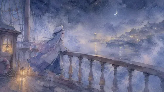
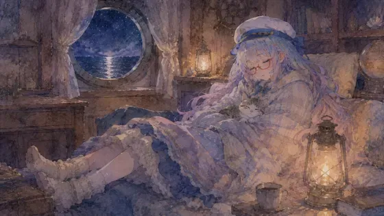
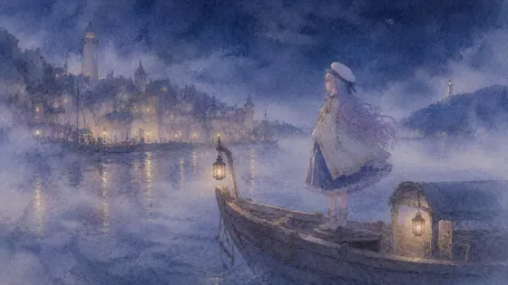
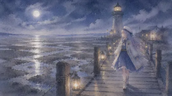
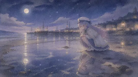
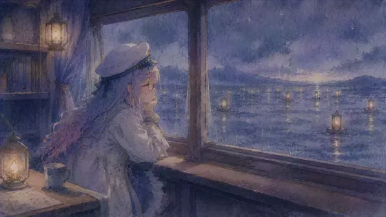
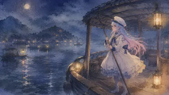
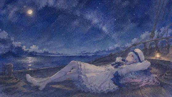
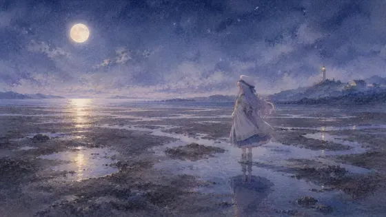
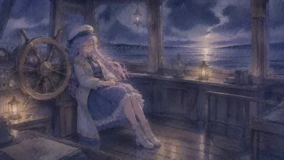
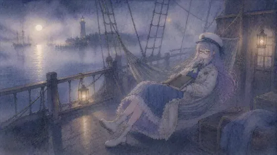
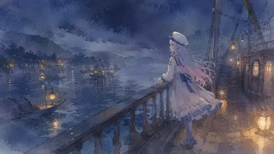
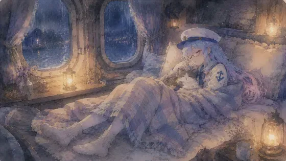
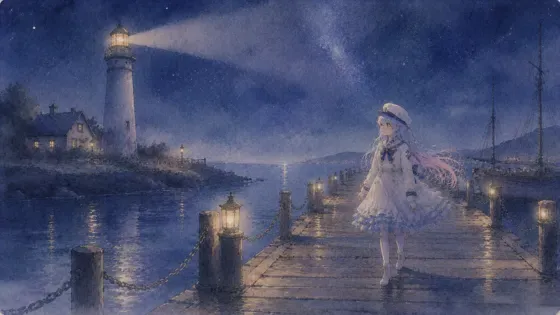
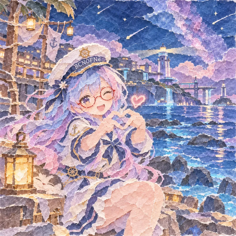
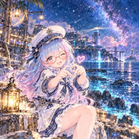
プロンプト
英語(English)
Redraw the attached picture in the style below, "Torn Washi" (torn washi paper collage). This is a change of technique only: the picture stays the same picture, and only the way it is drawn and painted changes. Every section describes that one finished image.

[How to use the attached image]
Treat the attached image as the fixed layout. Copy its framing, camera height, horizon line, and the position and size of every person and object as they are. Then throw away its original paint, line work and surface texture, and rebuild everything — people, background, sky, small props — with the materials and marks described below. Apply the style to the whole frame evenly, not only to the background or only to the character.

[What must stay the same]
Same number of people and objects, each in the same place. For each person: the same face shape and features, expression, eye direction, hairstyle and hair color, clothing design and colors, accessories (glasses keep their shape and color), pose, hand positions, body proportions and head-to-body ratio. Same overall color relationships and the same time of day. Do not add, remove or move anything, and do not invent new characters, animals, props or background buildings.

[If nothing is attached]
If no image is attached, first set up a simple scene that suits the request (one subject, a clear place, a readable silhouette), then draw that scene entirely in this style, following every section below in the same way.

[Aspect ratio]
Use the attached image's aspect ratio and canvas. Without an attachment, use the ratio named in the request, or 3:2 landscape if none is given. Do not crop or extend the frame.

[Lines and edges]
Most important: keep it rough and coarse. Use large, roughly hand-torn pieces of paper, each roughly one fifteenth to one thirtieth of the picture's width, and only a few pieces per area. Every piece has a fuzzy, uneven torn rim with white fibers showing, and pieces overlap clumsily with visible small gaps of backing paper between some of them. Do not build the image from many small fragments. There are no drawn lines. Shapes are defined by the torn edges of paper pieces, each with a soft, feathery rim of exposed fibers. A thin line, such as a branch, whisker or rope, is a narrow strip of paper twisted or torn long and thin, or a single thread-like fiber. Torn edges are irregular and slightly wavy, never straight scissor cuts.

[Shapes and how the surface is built]
The picture is a collage of hand-torn pieces of washi paper glued in overlapping layers on a plain backing sheet. Large areas such as sky, sea or walls are one or two big torn sheets, sometimes with a softly blended torn border between two shades. Other shapes are a few large torn pieces layered from far to near, overlapping roughly.

[Texture and material]
Soft, fibrous handmade washi with visible long fibers, flecks and slight translucency where papers overlap, making a darker tone at overlaps. Torn edges show a pale, fuzzy white rim where the colored surface layer tears away from the thicker fibers. Surfaces are matte and slightly crinkled by the glue.

[Color]
Keep the attached image's hues and relationships, translating each area into the nearest dyed washi color: gentle, slightly chalky, warm-toned papers in soft pinks, indigo, moss green, ochre, gray and cream. Subtle color variation inside a single paper, such as faint mottling or tie-dye streaks, is welcome. Overall tone stays soft rather than neon.

[Light and shading]
Light follows the attached image but is made by choosing lighter or darker papers for lit and shaded areas, with thin torn slivers of pale paper for highlights. Glowing areas use pale, thin paper that lets the backing show through. There are no cast shadows except a faint lift shadow under thick edges.

[Faces, hands and small details]
Faces are a few large pieces of pale paper, with the eyes, brows, nose and mouth as small torn scraps or very thin slivers of dark paper, keeping the attached person's identity and expression. Hair is several torn pieces layered along its flow in the original color. Glasses are thin torn strips in the original frame color. Hands are one or two torn pieces with the pose kept and fingers simplified.

[Finish]
A framed collage made of paper only, photographed straight on in soft even light. The whole image has a gentle, handmade, layered feel, with simplified forms and no tiny detail finer than a torn piece. The result must look like a finished piece made in this one technique from edge to edge, not a filter laid over the original.

[Do not mix in]
Do not use scissors-cut clean edges, printed patterns, brush paint or pen lines. No digital gradients, no cut-paper silhouette look and no foil or glitter. Not felt, not mosaic tiles, not stained glass, not a glued photo cutout. Do not mix in watercolor washes, blooms or paper-white bleeding, and do not blend in any other art style than the one described here. No readable text, letters, numbers, logos, watermarks or signatures unless they were already in the attached image.

[If instructions conflict]
First keep the layout and the people of the attached image, then apply this style's materials and marks fully, then match the color relationships, and only then work on fine detail. If keeping a detail exactly would break the style, simplify the detail in the style's own way rather than dropping the style.
日本語
添付画像を、下の画風「和紙のちぎり絵」(ちぎり絵)で描き直してください。変えるのは描き方だけで、絵そのものは同じ絵のままにします。どの段も、その 1 枚の完成した絵の話です。

【添付画像の使い方】
添付画像を動かせない下図として扱う。画角・カメラの高さ・地平線の位置、人物と物の位置と大きさをそのまま写す。そのうえで、元の塗り・線・表面の質感は全部捨て、人物・背景・空・小物のすべてを、下に書いた材料と手の跡で作り直す。画風は画面全体に同じ強さでかける。背景だけ、人物だけにかけない。

【変えない所】
人物と物の数、それぞれの位置は同じ。人物は、顔の形と目鼻立ち・表情・視線・髪型と髪の色・服のデザインと色・小物(メガネは形も色も保つ)・ポーズ・手の位置・体の比率と頭身を変えない。色どうしの関係と時間帯も同じ。何も足さず、消さず、動かさない。新しい人物・動物・小物・背景の建物を作らない。

【添付が無い時】
添付が無い時は、依頼に合う簡単な場面(主役 1 つ・場所がはっきり・形が読みやすい)を先に決め、その場面を最初から最後までこの画風で描く。下の段は同じように全部守る。

【比率】
添付画像の比率とキャンバスに合わせる。添付が無い時は依頼の比率、指定が無ければ横長 3:2。画面を切ったり広げたりしない。

【線と縁】
いちばん大事:雑でざっくりに。紙は大きめに手で荒くちぎり、1 枚の大きさは画面の幅の 15 分の 1〜30 分の 1 くらい、1 つの所に使う枚数は少なくする。どの紙片も、白い繊維が見える毛羽立ったでこぼこの縁で、紙は不器用に重なり、所々に台紙の小さな隙間が見える。細かいかけらをたくさん並べて作らない。描いた線は無し。形は、ちぎった紙の縁で決まる。縁には、繊維が出た、やわらかい毛羽立ちがある。枝・ひげ・縄のような細い線は、細くよじったり細長くちぎったりした紙の帯、または糸のような繊維 1 本。ちぎった縁はふぞろいで少し波打ち、はさみで切ったような真っすぐな縁にはしない。

【形と面の作り方】
絵は、手でちぎった和紙を、無地の台紙に重ねて貼ったコラージュ。空・海・壁のような広い面は大きくちぎった紙 1〜2 枚で、2 つの色のあいだは、ちぎった縁をやわらかく重ねてぼかすこともある。ほかの形も大きめにちぎった数枚の紙を、遠いものから近いものへざっくり重ねる。

【質感・素材】
やわらかくて繊維の多い手漉きの和紙。長い繊維や小さな斑点が見え、紙が重なった所は少し透けて、重なりの色が濃くなる。ちぎった縁には、色のついた表の層が太い繊維からはがれた、白っぽく毛羽立った縁が出る。面はつや消しで、糊で少しだけしわが寄る。

【色】
添付画像の色合いと関係を保ち、どの面もいちばん近い染めの和紙の色に置き換える:やさしい、少し粉っぽい、暖かみのある紙。淡いピンク・藍・苔色・黄土・灰・クリーム。1 枚の紙の中のかすかなまだらや染めむらは歓迎する。全体の調子はネオンのようでなく、やわらかく。

【光と陰影】
光は添付画像どおりだが、光の当たる所と影の所で明るい紙と暗い紙を選んで作る。ハイライトは淡い紙を細くちぎった切れ端。光る所は薄い紙にして、台紙が透けて見えるようにする。落ち影は無く、厚い縁の下にかすかな浮いた影があるだけ。

【顔・手・細かい所】
顔は、淡い紙の大きなかけら数枚。目・眉・鼻・口は、暗い紙の小さなちぎれ端か細い切れ端で置き、添付の人の顔立ちと表情を保つ。髪は元の色のちぎった紙を、流れに沿って数枚重ねる。メガネは元の枠の色の細くちぎった帯。手は 1〜2 枚のちぎった紙で、ポーズを保って指は簡単にする。

【仕上がり】
紙だけで作った額装のコラージュを、やわらかいむらのない光で正面から撮ったもの。全体に、やさしい手作りの重なりがあり、形は簡単にして、ちぎった紙 1 枚より細かい描き込みは無い。端から端まで、この 1 つの技法で作った完成品に見えること。元の絵にフィルターを重ねただけに見えないこと。

【混ぜない物】
はさみで切ったきれいな縁、印刷の模様、筆の絵の具、ペンの線を使わない。デジタルのグラデーション、切り絵のシルエット風、箔やラメも入れない。フェルト、モザイクのタイル、ステンドグラス、貼り付けた写真の切り抜きと混ぜない。水彩のにじみ・たまり・紙の白のぼかしは入れない。ここに書いた画風以外の画風を混ぜない。添付画像に元からある物を除き、読める文字・数字・ロゴ・透かし・署名を入れない。

【指示がぶつかった時】
まず添付画像の配置と人物を守る。次にこの画風の材料と手の跡を全体にしっかりかける。次に色の関係を合わせ、細部は最後。細部を正確に残すと画風が崩れる時は、画風を捨てずに、その画風のやり方で細部を省略する。
ほかの呼び方:ちぎり絵・和紙ちぎり絵・ちぎり紙・貼り絵・和紙
プロンプトは、ご自分の画像生成にご自由にお使いください(商用も可)。使う時に「BCNOFNe」の名前を添えてもらえると嬉しいです(任意)。見本の画像の転載・再配布はご遠慮ください。使われ方を知るため、押されたボタンや開かれたページの回数(番号・言語・混ぜた画風の組み合わせ)を、Cloudflare のサービスを使った当サイトの集計用サーバーで数えています。入れた文字は送りません。Cookie や端末の識別子は使いません。サイト全体のアクセス数を見るため、Cloudflare Web Analytics(Cookie なし)も使っています。通信や記録の扱いは、Cloudflare, Inc. のプライバシーポリシーに従います。