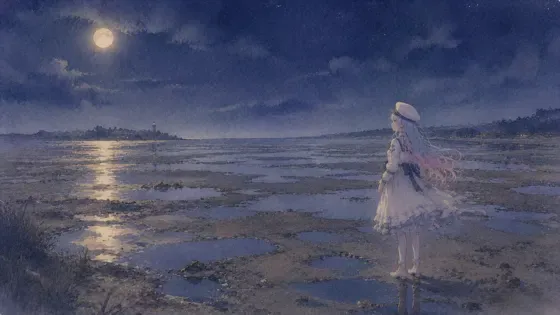
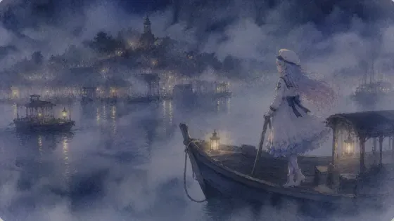
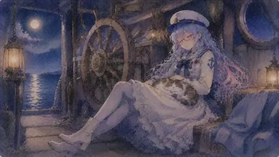
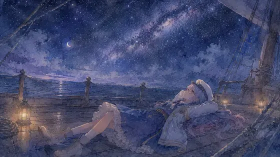
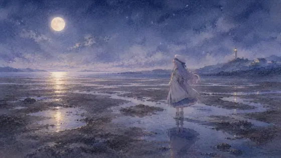
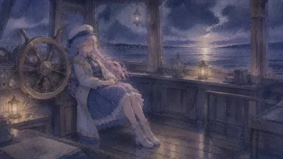
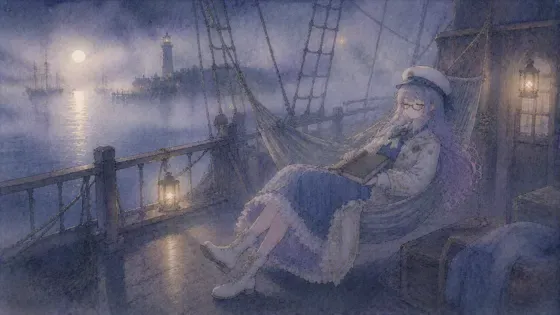
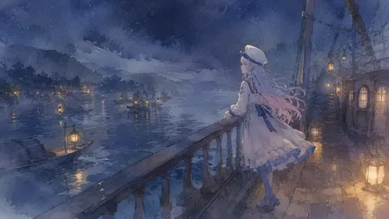
プロンプト
英語(English)
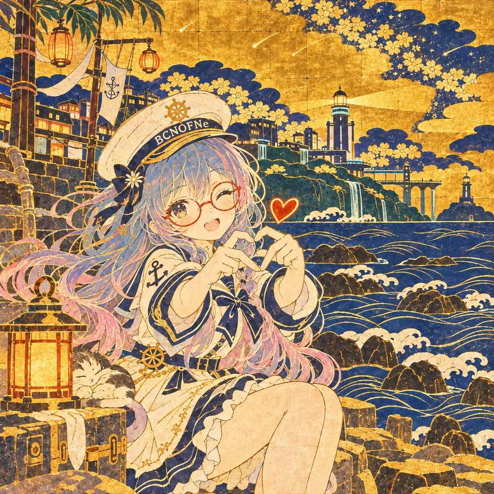
Redraw the attached picture in the style below, "Gold Screen Rinpa" (Rinpa gold-leaf screen painting). This is a change of technique only: the picture stays the same picture, and only the way it is drawn and painted changes. Every section describes that one finished image.

[How to use the attached image]
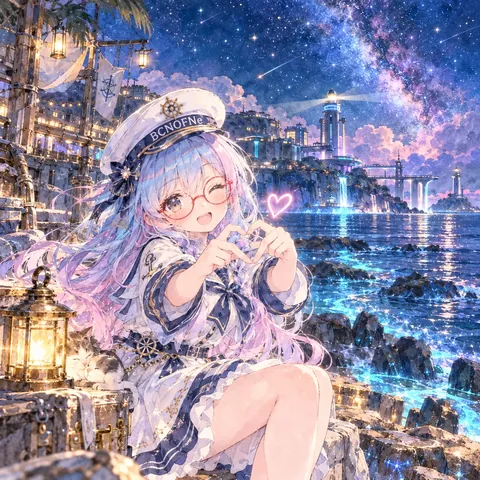
Treat the attached image as the fixed layout. Copy its framing, camera height, horizon line, and the position and size of every person and object as they are. Then throw away its original paint, line work and surface texture, and rebuild everything — people, background, sky, small props — with the materials and marks described below. Apply the style to the whole frame evenly, not only to the background or only to the character.

[What must stay the same]
Same number of people and objects, each in the same place. For each person: the same face shape and features, expression, eye direction, hairstyle and hair color, clothing design and colors, accessories (glasses keep their shape and color), pose, hand positions, body proportions and head-to-body ratio. Same overall color relationships and the same time of day. Do not add, remove or move anything, and do not invent new characters, animals, props or background buildings.

[If nothing is attached]
If no image is attached, first set up a simple scene that suits the request (one subject, a clear place, a readable silhouette), then draw that scene entirely in this style, following every section below in the same way.

[Aspect ratio]
Use the attached image's aspect ratio and canvas. Without an attachment, use the ratio named in the request, or 3:2 landscape if none is given. Do not crop or extend the frame.

[Lines and edges]
Outlines are light and sparing. Many forms have no line at all and are defined by the edge of one flat color against the gold; where a contour is needed, it is a supple, even stroke in dark mineral ink or a deeper tone of the shape's own color. Shapes are bold, simplified and decorative, with graceful curves, stylized leaf and wave patterns repeated like stamped designs. Keep every shape and position of the attached image.

[Shapes and how the surface is built]
The background is a field of gold leaf laid in square sheets, with faint seams between them, standing in for sky, ground and distance; there is no realistic horizon or perspective. Figures and objects are painted on this gold in flat, opaque mineral pigments, each one an even flat shape. Water, hills and clouds are reduced to a few bold sweeping forms, sometimes bands of mist in plain gold. Detail comes from repeated pattern, not from shading.

[Texture and material]
Fine, slightly cracked gold leaf with a soft shimmer, small square seams and a few worn spots; powdery, chalky mineral pigment in flat areas with a granular edge; a faint silk or paper weave underneath. Metallic parts are matte-gold rather than mirror-bright.

[Color]
Keep the attached image's hues and their relationships, and translate them into a limited mineral palette set against gold: malachite green, azurite blue, vermilion, cinnabar red, lead white, deep indigo and black, with soft ochre. Colors are opaque and flat, without color mixing on the surface. Each object keeps its original hue family, and the gold takes over the background.

[Light and shading]
There is no cast light and no realistic shadow. Light is the gold itself, glowing evenly across the whole surface. Volume is suggested only by pattern changes, a darker flat second tone, or thin lines on garments and petals. Sunsets, lamps and glows are flat circles of brighter or redder pigment.

[Faces, hands and small details]
Faces are calm and simplified: a pale flat oval, with a few fine, fluid lines for eyes, brows, nose and mouth, in the attached person's expression and gaze, with only a faint pink on the cheeks. Hair is a dark, bold flat shape with long even strand lines, keeping its original color and silhouette. Glasses keep their exact shape and frame color as fine lines. Hands are drawn with graceful, fine contour lines, with the pose kept.

[Finish]
Looks like a folding screen painting, photographed flat with even light so the gold gleams softly. The composition fills the frame exactly as the attached image does, and the picture should read as flat, decorative and bold from a distance. The result must look like a finished piece made in this one technique from edge to edge, not a filter laid over the original.

[Do not mix in]
Do not use wet pooling or bleeding of color, soft blending, or tonal shading. No realistic perspective, cast shadow or photographic gold with mirror reflection. Add no seals, written text or panel frames. Do not mix in watercolor washes, blooms or paper-white bleeding, and do not blend in any other art style than the one described here. No readable text, letters, numbers, logos, watermarks or signatures unless they were already in the attached image.

[If instructions conflict]
First keep the layout and the people of the attached image, then apply this style's materials and marks fully, then match the color relationships, and only then work on fine detail. If keeping a detail exactly would break the style, simplify the detail in the style's own way rather than dropping the style.
日本語
添付画像を、下の画風「金屏風の琳派」(琳派(金地の屏風絵))で描き直してください。変えるのは描き方だけで、絵そのものは同じ絵のままにします。どの段も、その 1 枚の完成した絵の話です。

【添付画像の使い方】
添付画像を動かせない下図として扱う。画角・カメラの高さ・地平線の位置、人物と物の位置と大きさをそのまま写す。そのうえで、元の塗り・線・表面の質感は全部捨て、人物・背景・空・小物のすべてを、下に書いた材料と手の跡で作り直す。画風は画面全体に同じ強さでかける。背景だけ、人物だけにかけない。

【変えない所】
人物と物の数、それぞれの位置は同じ。人物は、顔の形と目鼻立ち・表情・視線・髪型と髪の色・服のデザインと色・小物(メガネは形も色も保つ)・ポーズ・手の位置・体の比率と頭身を変えない。色どうしの関係と時間帯も同じ。何も足さず、消さず、動かさない。新しい人物・動物・小物・背景の建物を作らない。

【添付が無い時】
添付が無い時は、依頼に合う簡単な場面(主役 1 つ・場所がはっきり・形が読みやすい)を先に決め、その場面を最初から最後までこの画風で描く。下の段は同じように全部守る。

【比率】
添付画像の比率とキャンバスに合わせる。添付が無い時は依頼の比率、指定が無ければ横長 3:2。画面を切ったり広げたりしない。

【線と縁】
輪郭は軽く、控えめ。多くの形は線を持たず、金に対する 1 色の平らな面の縁で決まる。輪郭が要る所は、濃い鉱物の墨か、その形自身の色を深めた色の、しなやかで均一な筆。形は大胆に単純化した装飾的なもので、優雅な曲線に、型で押したようにくり返す葉や波の模様。形と位置は添付画像のまま。

【形と面の作り方】
背景は、四角い箔を貼り重ねた金箔の地で、うっすら継ぎ目があり、空・地面・遠くの代わりをする。写実の水平線も遠近法も無い。人や物はこの金の上に、不透明な鉱物の顔料で平らに塗った均一な形。水・丘・雲は大胆に流れる数個の形に減らし、霞は金そのままの帯にしてもよい。細部は陰影でなく、くり返しの模様から出す。

【質感・素材】
細かくわずかにひび割れた、やわらかく輝く金箔。小さな四角い継ぎ目と、少しの擦れ。平らな面の鉱物の顔料は粉っぽくチョーク質で、縁に粒がある。下にはかすかな絹か紙の織り目。金属の部分は鏡の光沢ではなく、つや消しの金。

【色】
添付画像の色合いと関係を保ち、金に映える限られた鉱物の色へ置き換える:孔雀石の緑、群青、朱、辰砂の赤、鉛白、深い藍と墨、やわらかい黄土。色は不透明で平らで、表面で混ぜない。物ごとの元の色の系統は保ち、背景は金が受け持つ。

【光と陰影】
落ちる光も、写実の影も無い。光は金そのもので、画面全体をむらなく輝かせる。立体は、模様の変化、濃い平らな 2 色目、着物や花びらの細い線だけで匂わせる。夕日・灯り・輝きは、より明るいか赤みのある顔料の平らな円で。

【顔・手・細かい所】
顔は落ち着いて単純化する:淡い平らな卵形に、目・眉・鼻・口をなめらかな細い数本の線で。添付の人の表情と視線に合わせ、頬にはごくかすかな桃色だけ。髪は暗く大胆な平らな形に、長くそろった毛筋で、元の色とシルエットを保つ。メガネは形と枠の色を保った細い線で。手は優雅な細い輪郭線で、ポーズは保つ。

【仕上がり】
屏風の絵を、金がやわらかく光るようにむらのない光で平らに撮った仕上がり。構図は添付画像と同じく画面いっぱいで、遠くから見ても平らで装飾的で大胆に読める。端から端まで、この 1 つの技法で作った完成品に見えること。元の絵にフィルターを重ねただけに見えないこと。

【混ぜない物】
色が濡れてたまる・にじむ表現、やわらかい混ぜ、調子の陰影は使わない。写実の遠近法、落ち影、鏡のように映る写真風の金も避ける。落款・書き文字・パネルの枠は足さない。水彩のにじみ・たまり・紙の白のぼかしは入れない。ここに書いた画風以外の画風を混ぜない。添付画像に元からある物を除き、読める文字・数字・ロゴ・透かし・署名を入れない。

【指示がぶつかった時】
まず添付画像の配置と人物を守る。次にこの画風の材料と手の跡を全体にしっかりかける。次に色の関係を合わせ、細部は最後。細部を正確に残すと画風が崩れる時は、画風を捨てずに、その画風のやり方で細部を省略する。
ほかの呼び方:琳派(金地の屏風絵)・琳派・金屏風・屏風絵・金箔・金地
プロンプトは、ご自分の画像生成にご自由にお使いください(商用も可)。使う時に「BCNOFNe」の名前を添えてもらえると嬉しいです(任意)。見本の画像の転載・再配布はご遠慮ください。使われ方を知るため、押されたボタンや開かれたページの回数(番号・言語・混ぜた画風の組み合わせ)を、Cloudflare のサービスを使った当サイトの集計用サーバーで数えています。入れた文字は送りません。Cookie や端末の識別子は使いません。サイト全体のアクセス数を見るため、Cloudflare Web Analytics(Cookie なし)も使っています。通信や記録の扱いは、Cloudflare, Inc. のプライバシーポリシーに従います。