プロンプト
英語(English)
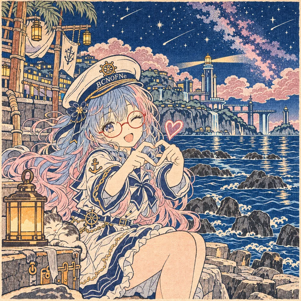
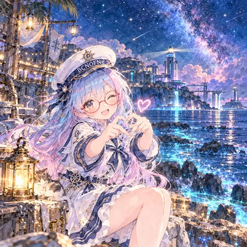
Redraw the attached picture in the style below, "Floating World Woodblock" (ukiyo-e style multicolor woodblock print). This is a change of technique only: the picture stays the same picture, and only the way it is drawn and painted changes. Every section describes that one finished image.

[How to use the attached image]
Treat the attached image as the fixed layout. Copy its framing, camera height, horizon line, and the position and size of every person and object as they are. Then throw away its original paint, line work and surface texture, and rebuild everything — people, background, sky, small props — with the materials and marks described below. Apply the style to the whole frame evenly, not only to the background or only to the character.

[What must stay the same]
Same number of people and objects, each in the same place. For each person: the same face shape and features, expression, eye direction, hairstyle and hair color, clothing design and colors, accessories (glasses keep their shape and color), pose, hand positions, body proportions and head-to-body ratio. Same overall color relationships and the same time of day. Do not add, remove or move anything, and do not invent new characters, animals, props or background buildings.

[If nothing is attached]
If no image is attached, first set up a simple scene that suits the request (one subject, a clear place, a readable silhouette), then draw that scene entirely in this style, following every section below in the same way.

[Aspect ratio]
Use the attached image's aspect ratio and canvas. Without an attachment, use the ratio named in the request, or 3:2 landscape if none is given. Do not crop or extend the frame.

[Lines and edges]
Fine, confident outlines carved from a key block: an even, slightly tapered black or deep indigo line about one millimeter wide in the scale of the print, with no sketchy repeats. Water, wind and hair are described with rhythmic, repeated curved lines; clouds and waves get scalloped, stylized edges.

[Shapes and how the surface is built]
Every color area is a separate carved block printed flat, with clean borders that sit just inside the key line. Most areas are one solid tone. Use soft graded printing only where a woodblock printer would: the top of the sky, the horizon of the sea, and the hem of large garments, each fading in one direction.

[Texture and material]
Soft handmade washi paper with visible fibers, slight absorbency at the edges of each color, a faint woodgrain pattern inside large flat areas, and the light pressure marks of a baren. A thin margin of bare paper around the image is allowed.

[Color]
Map the attached image's colors onto a classic woodblock set: Prussian blue, indigo, vermilion, persimmon, ochre, pale pink, sage green, soft gray and black, plus the cream of the paper. Keep each object's original hue family; reduce the whole picture to about eight to ten inks.

[Light and shading]
No cast shadows and no realistic shading. Depth and time of day are shown by color choice and graded skies only: a dusk sky becomes a band of warm ink fading to blue, night becomes deep indigo at the top. Lamps and windows are flat spots of bright ink.

[Faces, hands and small details]
Faces become pale, flat areas with slender carved lines for the eyes, brows, nose and mouth, following the attached face's proportions and expression rather than a classical type. Hair keeps its original color and style but is drawn with neat, parallel strand lines. Glasses are drawn with the key line and filled with their frame color. Hands keep their pose with a few clean contour lines.

[Finish]
Looks like a real multicolor woodblock print photographed flat: crisp registration with at most a hair's breadth of misalignment, no gloss, gentle ink density variation. The result must look like a finished piece made in this one technique from edge to edge, not a filter laid over the original.

[Do not mix in]
No modern digital gradients, glows or lens effects. No Western perspective shading or photo-realistic faces. Do not add Japanese text, seals or cartouches unless they were already in the attached image. Do not mix in watercolor washes, blooms or paper-white bleeding, and do not blend in any other art style than the one described here. No readable text, letters, numbers, logos, watermarks or signatures unless they were already in the attached image.

[If instructions conflict]
First keep the layout and the people of the attached image, then apply this style's materials and marks fully, then match the color relationships, and only then work on fine detail. If keeping a detail exactly would break the style, simplify the detail in the style's own way rather than dropping the style.
日本語
添付画像を、下の画風「浮世の版木」(浮世絵風の多色木版)で描き直してください。変えるのは描き方だけで、絵そのものは同じ絵のままにします。どの段も、その 1 枚の完成した絵の話です。

【添付画像の使い方】
添付画像を動かせない下図として扱う。画角・カメラの高さ・地平線の位置、人物と物の位置と大きさをそのまま写す。そのうえで、元の塗り・線・表面の質感は全部捨て、人物・背景・空・小物のすべてを、下に書いた材料と手の跡で作り直す。画風は画面全体に同じ強さでかける。背景だけ、人物だけにかけない。

【変えない所】
人物と物の数、それぞれの位置は同じ。人物は、顔の形と目鼻立ち・表情・視線・髪型と髪の色・服のデザインと色・小物(メガネは形も色も保つ)・ポーズ・手の位置・体の比率と頭身を変えない。色どうしの関係と時間帯も同じ。何も足さず、消さず、動かさない。新しい人物・動物・小物・背景の建物を作らない。

【添付が無い時】
添付が無い時は、依頼に合う簡単な場面(主役 1 つ・場所がはっきり・形が読みやすい)を先に決め、その場面を最初から最後までこの画風で描く。下の段は同じように全部守る。

【比率】
添付画像の比率とキャンバスに合わせる。添付が無い時は依頼の比率、指定が無ければ横長 3:2。画面を切ったり広げたりしない。

【線と縁】
主版(おもはん)を彫ったような、細くて迷いのない輪郭線。刷り上がりで 1 mm ほど、少し入り抜きのある黒か濃い藍の線で、描き直しの重ね線は無し。水・風・髪はリズムのある曲線のくり返しで、雲と波は波形にととのえた縁で表す。

【形と面の作り方】
色ごとに別の版木を彫って平らに刷る。色の面の境は輪郭線のすぐ内側でくっきり止まる。ほとんどの面は 1 色のべた。ぼかし摺りは摺師がやる所だけ使う:空の上の方、海の水平線、大きな着物の裾。どれも一方向へ薄くなる。

【質感・素材】
繊維の見える柔らかい手漉きの和紙。色の縁でインクが少し紙にしみる。広いべたの中にかすかな木目。ばれんで押した軽い跡。絵の周りに紙の余白が少し残ってもよい。

【色】
添付画像の色を、木版の基本の色に当てはめる:ベロ藍・藍・朱・柿・黄土・淡い桃・若草・薄鼠・墨、それに紙のクリーム色。物ごとの元の色の系統は保ち、全体を 8〜10 色のインクにしぼる。

【光と陰影】
落ち影も写実的な陰影も無し。奥行きと時間帯は、色の選び方とぼかし摺りの空だけで見せる。夕方は暖かい色から青へ移る帯、夜は上が濃い藍。灯りや窓は明るいインクの平らな点。

【顔・手・細かい所】
顔は淡い平らな面に、目・眉・鼻・口を細い彫りの線で入れる。昔の美人画の型には寄せず、添付の顔の比率と表情に合わせる。髪は元の色と髪型のまま、そろった平行の毛筋で描く。メガネは輪郭線で描いて枠の色で埋める。手はポーズを保ち、すっきりした輪郭線数本で。

【仕上がり】
本物の多色木版を平らに撮った写真のような仕上がり。見当はきっちり合い、ずれても髪の毛 1 本ほど。光沢なし、インクの濃さにわずかなむら。端から端まで、この 1 つの技法で作った完成品に見えること。元の絵にフィルターを重ねただけに見えないこと。

【混ぜない物】
今風のデジタルのグラデーション・光のにじみ・レンズ効果を入れない。西洋の陰影や写真のような顔にしない。添付画像に元から無い日本語の文字・落款・題箋を足さない。水彩のにじみ・たまり・紙の白のぼかしは入れない。ここに書いた画風以外の画風を混ぜない。添付画像に元からある物を除き、読める文字・数字・ロゴ・透かし・署名を入れない。

【指示がぶつかった時】
まず添付画像の配置と人物を守る。次にこの画風の材料と手の跡を全体にしっかりかける。次に色の関係を合わせ、細部は最後。細部を正確に残すと画風が崩れる時は、画風を捨てずに、その画風のやり方で細部を省略する。
ほかの呼び方:浮世絵風の多色木版・浮世絵・浮世絵風・木版画・錦絵・和版画
プロンプトは、ご自分の画像生成にご自由にお使いください(商用も可)。使う時に「BCNOFNe」の名前を添えてもらえると嬉しいです(任意)。見本の画像の転載・再配布はご遠慮ください。使われ方を知るため、押されたボタンや開かれたページの回数(番号・言語・混ぜた画風の組み合わせ)を、Cloudflare のサービスを使った当サイトの集計用サーバーで数えています。入れた文字は送りません。Cookie や端末の識別子は使いません。サイト全体のアクセス数を見るため、Cloudflare Web Analytics(Cookie なし)も使っています。通信や記録の扱いは、Cloudflare, Inc. のプライバシーポリシーに従います。