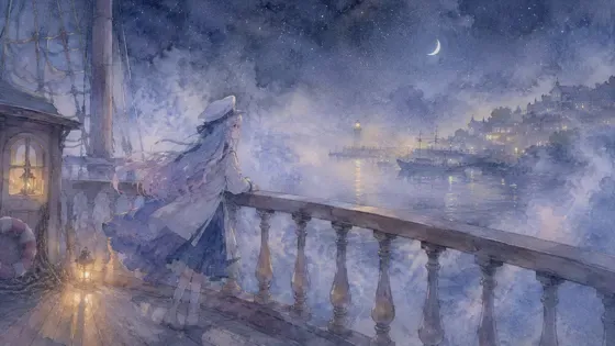
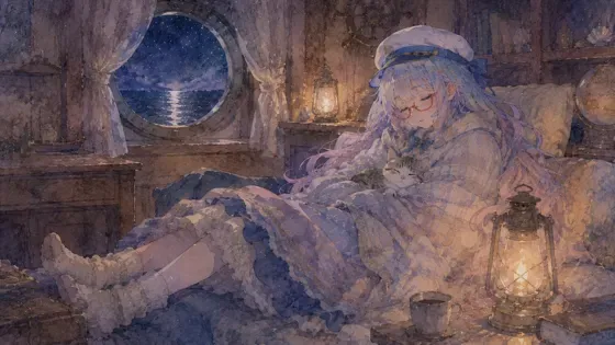
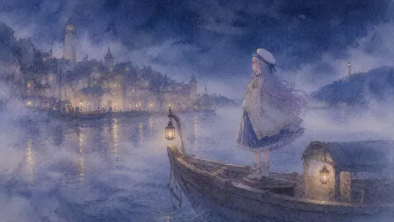
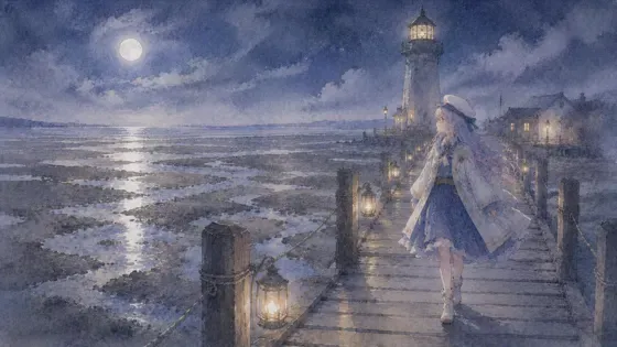
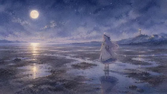
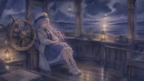
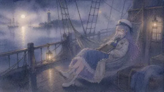
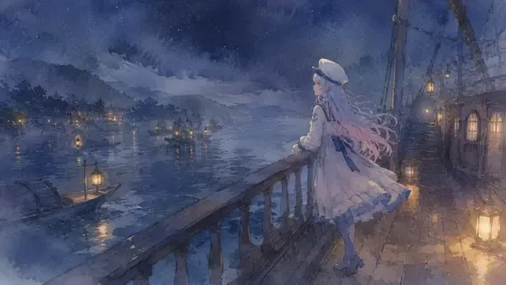
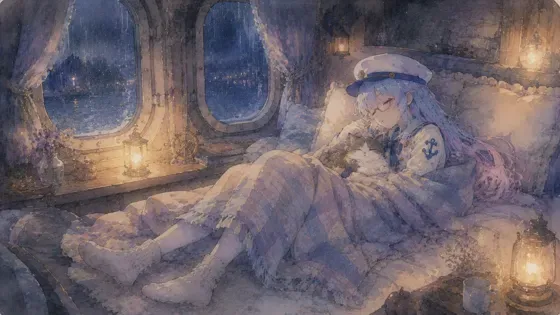
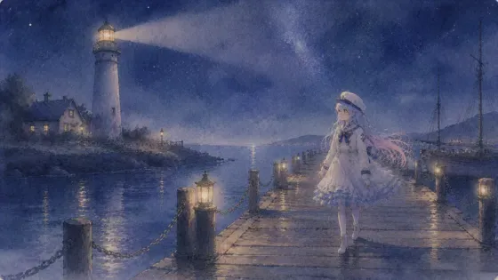
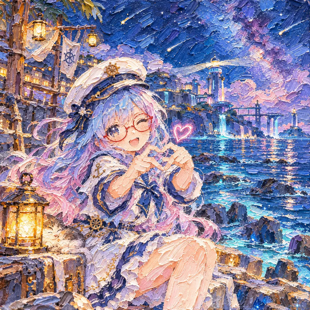
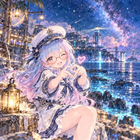
プロンプト
英語(English)
Redraw the attached picture in the style below, "Thick Oil Strokes" (impasto oil painting). This is a change of technique only: the picture stays the same picture, and only the way it is drawn and painted changes. Every section describes that one finished image.

[How to use the attached image]
Treat the attached image as the fixed layout. Copy its framing, camera height, horizon line, and the position and size of every person and object as they are. Then throw away its original paint, line work and surface texture, and rebuild everything — people, background, sky, small props — with the materials and marks described below. Apply the style to the whole frame evenly, not only to the background or only to the character.

[What must stay the same]
Same number of people and objects, each in the same place. For each person: the same face shape and features, expression, eye direction, hairstyle and hair color, clothing design and colors, accessories (glasses keep their shape and color), pose, hand positions, body proportions and head-to-body ratio. Same overall color relationships and the same time of day. Do not add, remove or move anything, and do not invent new characters, animals, props or background buildings.

[If nothing is attached]
If no image is attached, first set up a simple scene that suits the request (one subject, a clear place, a readable silhouette), then draw that scene entirely in this style, following every section below in the same way.

[Aspect ratio]
Use the attached image's aspect ratio and canvas. Without an attachment, use the ratio named in the request, or 3:2 landscape if none is given. Do not crop or extend the frame.

[Lines and edges]
There are no thin outlines. Edges are formed where one thick stroke of paint meets another, sometimes marked by a dark, loose stroke drawn with the edge of a brush or a palette knife. Shapes are built with broad, confident strokes that follow the form: curved along a sleeve, vertical for grass, horizontal for water.

[Shapes and how the surface is built]
Paint is laid on thick in ridges, buttery ribbons and flat knife-scraped planes, so the surface has real relief. Large masses are blocked in with wide strokes first, then lighter and thicker paint is dragged over them in the lit areas. Some areas are scraped smooth with a palette knife; others keep tall, curling brush ridges. Colors partly mix on the canvas and partly stay streaked side by side.

[Texture and material]
Visible bristle marks, tiny hairs of paint dragged along the ridges, glossy raised crests, thin paint in the hollows, and the weave of canvas showing in the thinnest areas. The paint has a slightly wet, buttery shine on its highest ridges and a deeper, matte look in the shadows.

[Color]
Keep the hues and color relationships of the attached image, then express them in rich oil colors. Colors are built from several neighboring strokes rather than one flat tone: a red area has pink, orange and deep crimson in it. Shadows are mixed with deep blue or violet rather than black. Whites are warm creamy paint.

[Light and shading]
Light follows the attached image's direction and is boosted by the relief itself: raised ridges catch small highlights on the lit side and cast tiny shadows on the other, so every stroke reads as a physical shape. Brightest highlights are thick dabs of light paint placed last.

[Faces, hands and small details]
Build the face from a handful of confident planes: a warm light tone, cooler shadow strokes, a thick dab on the nose and brow highlight, matching the attached person's likeness, expression and head angle without smoothing it into a photo. Eyes and mouth are small dark and red strokes. Hair is a few direction-following ridges in the original color. Glasses are quick strokes of the original frame color. Hands are blocked in with broad strokes and only a few finger marks.

[Finish]
A finished oil painting on canvas photographed straight on in even light, with the raised paint casting small shadows and the edge of the canvas just visible. The result must look like a finished piece made in this one technique from edge to edge, not a filter laid over the original.

[Do not mix in]
No flat digital fills, airbrushed gradients, thin glazing that looks smooth like a photo, or tiny dabs all over like pointillism. Do not mix in gouache, ink lines, cartoon outlines, or add a gold frame or signature. Do not mix in watercolor washes, blooms or paper-white bleeding, and do not blend in any other art style than the one described here. No readable text, letters, numbers, logos, watermarks or signatures unless they were already in the attached image.

[If instructions conflict]
First keep the layout and the people of the attached image, then apply this style's materials and marks fully, then match the color relationships, and only then work on fine detail. If keeping a detail exactly would break the style, simplify the detail in the style's own way rather than dropping the style.
日本語
添付画像を、下の画風「厚塗りの油」(油彩の厚塗り(インパスト))で描き直してください。変えるのは描き方だけで、絵そのものは同じ絵のままにします。どの段も、その 1 枚の完成した絵の話です。

【添付画像の使い方】
添付画像を動かせない下図として扱う。画角・カメラの高さ・地平線の位置、人物と物の位置と大きさをそのまま写す。そのうえで、元の塗り・線・表面の質感は全部捨て、人物・背景・空・小物のすべてを、下に書いた材料と手の跡で作り直す。画風は画面全体に同じ強さでかける。背景だけ、人物だけにかけない。

【変えない所】
人物と物の数、それぞれの位置は同じ。人物は、顔の形と目鼻立ち・表情・視線・髪型と髪の色・服のデザインと色・小物(メガネは形も色も保つ)・ポーズ・手の位置・体の比率と頭身を変えない。色どうしの関係と時間帯も同じ。何も足さず、消さず、動かさない。新しい人物・動物・小物・背景の建物を作らない。

【添付が無い時】
添付が無い時は、依頼に合う簡単な場面(主役 1 つ・場所がはっきり・形が読みやすい)を先に決め、その場面を最初から最後までこの画風で描く。下の段は同じように全部守る。

【比率】
添付画像の比率とキャンバスに合わせる。添付が無い時は依頼の比率、指定が無ければ横長 3:2。画面を切ったり広げたりしない。

【線と縁】
細い輪郭線は無い。縁は、厚い絵の具の筆致と筆致が出会う所にでき、ときどき筆の腹やパレットナイフの縁で引いた暗いラフな筆致で示す。形は、形に沿った広く自信のある筆致で組み立てる:袖に沿って曲線、草は縦、水は横。

【形と面の作り方】
絵の具は、うねり・バターのようなリボン・ナイフでならした平らな面として厚く置かれ、表面には本物の凹凸がある。大きなかたまりをまず広い筆致で置き、明るい所に、より明るく厚い絵の具を引きずって重ねる。パレットナイフでなめらかにこそげた所と、高く巻いた筆のうねりを残した所がある。色は画面上で一部だけ混ざり、一部は筋のまま並ぶ。

【質感・素材】
毛先の跡が見え、うねりに沿って引きずられた絵の具の細い毛、つやのある盛り上がった頂、くぼみの薄い絵の具、いちばん薄い所に見えるキャンバスの織り目。いちばん高いうねりには少し濡れたバターのようなつやがあり、影はより深くつや消しに見える。

【色】
添付画像の色合いと色どうしの関係を保ち、豊かな油絵の具の色で表す。色は 1 つの平らな色でなく、隣り合う何本もの筆致で作る:赤い所にはピンク・オレンジ・深い紅が入る。影は黒でなく深い青か紫で混ぜる。白は暖かいクリーム色の絵の具。

【光と陰影】
光は添付画像の向きに従い、凹凸そのものがそれを強める。盛り上がったうねりは光の側で小さなハイライトを拾い、反対側に小さな影を落とすけん、どの筆致も実際の形に見える。いちばん明るいハイライトは、最後に置く厚く明るい絵の具のひと塗り。

【顔・手・細かい所】
顔は、自信のある少数の面で組む:暖かい明るい色、冷たい影の筆致、鼻と眉の光に厚いひと塗り。写真のようにならして滑らかにはせず、添付の人物の面影・表情・顔の向きに合わせる。目と口は小さな暗い筆致と赤い筆致。髪は元の色で、向きに沿った数本のうねり。メガネは元の枠の色の素早い筆致。手は広い筆致で面を置き、指の跡は数本だけ。

【仕上がり】
均一な光で正面から撮った、キャンバスの完成した油絵。盛り上がった絵の具が小さな影を落とし、キャンバスの端がわずかに見える。端から端まで、この 1 つの技法で作った完成品に見えること。元の絵にフィルターを重ねただけに見えないこと。

【混ぜない物】
平らなデジタルの塗り、エアブラシのグラデーション、写真のようになめらかな薄塗り、点描のような全面の小さな点を入れない。ガッシュ・インクの線・漫画の輪郭線を混ぜず、金の額縁や署名も足さない。水彩のにじみ・たまり・紙の白のぼかしは入れない。ここに書いた画風以外の画風を混ぜない。添付画像に元からある物を除き、読める文字・数字・ロゴ・透かし・署名を入れない。

【指示がぶつかった時】
まず添付画像の配置と人物を守る。次にこの画風の材料と手の跡を全体にしっかりかける。次に色の関係を合わせ、細部は最後。細部を正確に残すと画風が崩れる時は、画風を捨てずに、その画風のやり方で細部を省略する。
ほかの呼び方:油彩の厚塗り(インパスト)・油彩・油絵・厚塗り・インパスト・油絵の厚塗り
プロンプトは、ご自分の画像生成にご自由にお使いください(商用も可)。使う時に「BCNOFNe」の名前を添えてもらえると嬉しいです(任意)。見本の画像の転載・再配布はご遠慮ください。使われ方を知るため、押されたボタンや開かれたページの回数(番号・言語・混ぜた画風の組み合わせ)を、Cloudflare のサービスを使った当サイトの集計用サーバーで数えています。入れた文字は送りません。Cookie や端末の識別子は使いません。サイト全体のアクセス数を見るため、Cloudflare Web Analytics(Cookie なし)も使っています。通信や記録の扱いは、Cloudflare, Inc. のプライバシーポリシーに従います。