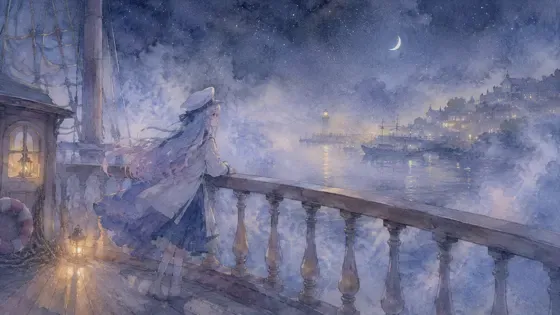
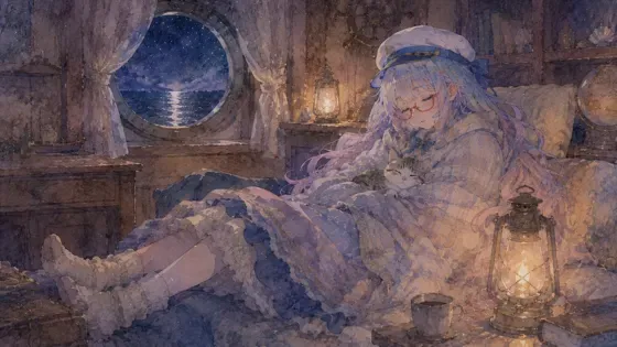
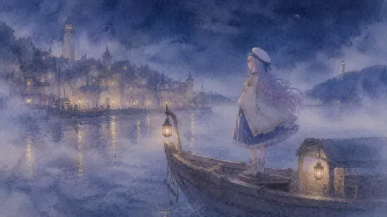
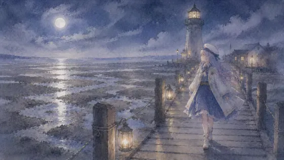
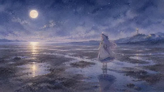
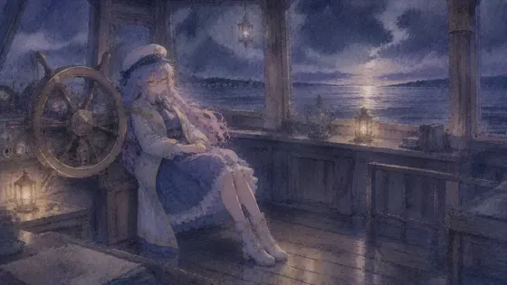
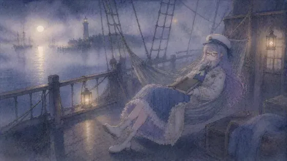
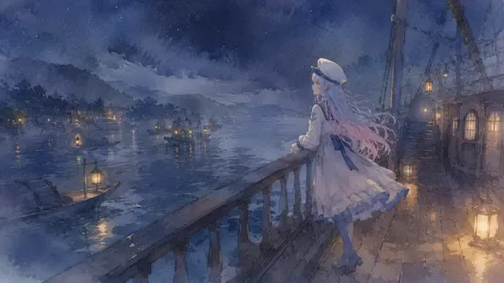
プロンプト
英語(English)
Redraw the attached picture in the style below, "Broken-Color Brushwork" (impressionist brushwork). This is a change of technique only: the picture stays the same picture, and only the way it is drawn and painted changes. Every section describes that one finished image.

[How to use the attached image]
Treat the attached image as the fixed layout. Copy its framing, camera height, horizon line, and the position and size of every person and object as they are. Then throw away its original paint, line work and surface texture, and rebuild everything — people, background, sky, small props — with the materials and marks described below. Apply the style to the whole frame evenly, not only to the background or only to the character.

[What must stay the same]
Same number of people and objects, each in the same place. For each person: the same face shape and features, expression, eye direction, hairstyle and hair color, clothing design and colors, accessories (glasses keep their shape and color), pose, hand positions, body proportions and head-to-body ratio. Same overall color relationships and the same time of day. Do not add, remove or move anything, and do not invent new characters, animals, props or background buildings.

[If nothing is attached]
If no image is attached, first set up a simple scene that suits the request (one subject, a clear place, a readable silhouette), then draw that scene entirely in this style, following every section below in the same way.

[Aspect ratio]
Use the attached image's aspect ratio and canvas. Without an attachment, use the ratio named in the request, or 3:2 landscape if none is given. Do not crop or extend the frame.

[Lines and edges]
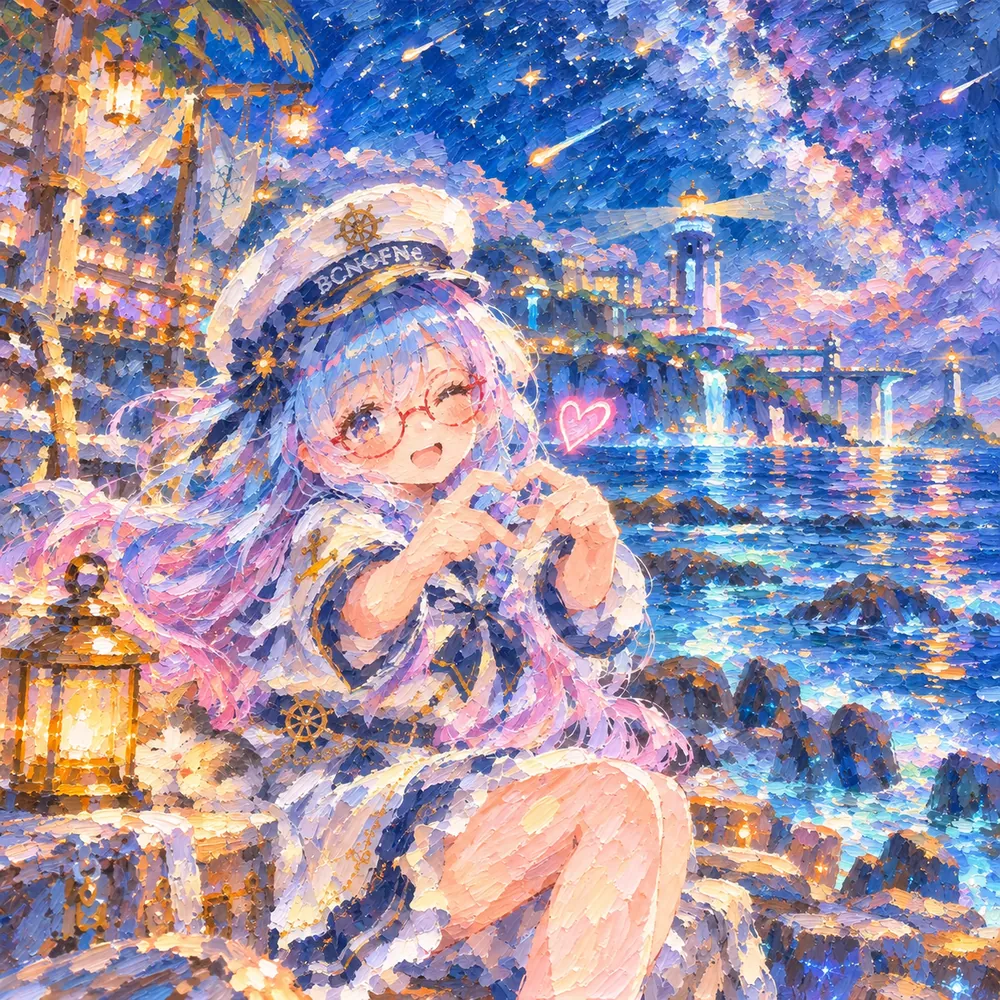
Most important: discard the attached image's clean anime line art and smooth cel shading completely. Rebuild every surface, including the face, hair, skin and clothes, from visible, separate, thick dabs of opaque oil paint about one to two centimeters long in the scale of the canvas, laid side by side in broken color. There are no outlines at all; edges exist only where two colors of strokes meet. Even the eyes, glasses and mouth are a handful of loose dabs, and the whole picture should look like a real oil painting photographed on canvas, with raised paint ridges catching the light. There are no outlines. Forms are suggested by the meeting of short, visible strokes of different colors, and edges stay soft and slightly broken, especially in the distance. Figures and objects are described by a few quick dabs and flicks rather than by contour, and may dissolve a little into their surroundings.

[Shapes and how the surface is built]
Build the whole surface from small, quick, separate strokes of paint laid side by side: short commas, dabs and dashes that follow the form, with the direction changing for sky, water, foliage and ground. Colors are placed next to each other rather than blended, so the eye mixes them. The paint is moderately thick and opaque, with the strokes visible from edge to edge, and no area is left as a flat fill.

[Texture and material]
A canvas surface with soft, visible brush marks, small ridges where strokes overlap, thin patches where the ground shows through, and a slightly dry, chalky matte finish. Strokes are lively and uneven in size, larger in the foreground and smaller toward the distance.

[Color]
Keep the hues and relationships of the attached image, then express them through broken color: a green area contains yellow, blue and touches of orange; a shadow contains violet and blue rather than gray or black. Keep a bright, high-key palette with clear complementary pairs such as blue next to orange, and warm light against cool shadow.

[Light and shading]
The picture is about the quality of light at one moment, following the attached image's light and time of day. Lit surfaces are made of warm, pale strokes; shadows are colored, cool and luminous. Reflections and glimmers on water are quick horizontal dashes. Sunlight scatters through the picture as bright flecks rather than hard edges.

[Faces, hands and small details]
Faces are painted with a few touches of warm and cool color, lightly modeled and slightly soft, and the details are suggested more than drawn. Keep the attached person's likeness, expression and head angle, readable at normal viewing distance. Hair is a mass of strokes in its original color with light flecks. Glasses are a quick, thin touch of the original frame color. Hands are indicated by a few strokes, with a clear overall pose.

[Finish]
A plein-air style oil painting on canvas, photographed straight on in even light, shimmering and slightly blurred when viewed at small size, with the brushwork readable up close. The result must look like a finished piece made in this one technique from edge to edge, not a filter laid over the original.

[Do not mix in]
No sharp outlines, no gray or black shadows, and no small mechanical dots in rows like pointillism. Do not add thick palette-knife ridges, smooth photo-like blending, or sketchy ink lines, and do not add a signature. Do not mix in watercolor washes, blooms or paper-white bleeding, and do not blend in any other art style than the one described here. No readable text, letters, numbers, logos, watermarks or signatures unless they were already in the attached image.

[If instructions conflict]
First keep the layout and the people of the attached image, then apply this style's materials and marks fully, then match the color relationships, and only then work on fine detail. If keeping a detail exactly would break the style, simplify the detail in the style's own way rather than dropping the style.
日本語
添付画像を、下の画風「光の筆触」(印象派の筆触)で描き直してください。変えるのは描き方だけで、絵そのものは同じ絵のままにします。どの段も、その 1 枚の完成した絵の話です。

【添付画像の使い方】
添付画像を動かせない下図として扱う。画角・カメラの高さ・地平線の位置、人物と物の位置と大きさをそのまま写す。そのうえで、元の塗り・線・表面の質感は全部捨て、人物・背景・空・小物のすべてを、下に書いた材料と手の跡で作り直す。画風は画面全体に同じ強さでかける。背景だけ、人物だけにかけない。

【変えない所】
人物と物の数、それぞれの位置は同じ。人物は、顔の形と目鼻立ち・表情・視線・髪型と髪の色・服のデザインと色・小物(メガネは形も色も保つ)・ポーズ・手の位置・体の比率と頭身を変えない。色どうしの関係と時間帯も同じ。何も足さず、消さず、動かさない。新しい人物・動物・小物・背景の建物を作らない。

【添付が無い時】
添付が無い時は、依頼に合う簡単な場面(主役 1 つ・場所がはっきり・形が読みやすい)を先に決め、その場面を最初から最後までこの画風で描く。下の段は同じように全部守る。

【比率】
添付画像の比率とキャンバスに合わせる。添付が無い時は依頼の比率、指定が無ければ横長 3:2。画面を切ったり広げたりしない。

【線と縁】
いちばん大事:添付画像のきれいなアニメの線画となめらかなアニメ塗りは全部捨てる。顔・髪・肌・服も含めたすべての面を、キャンバスの縮尺で 1〜2 cm ほどの、離れて見える厚い不透明な油絵の具の短い筆跡を並べて、色を分けたまま作り直す。輪郭線は一本も無く、縁は 2 つの色の筆跡が出会う所にだけある。目・メガネ・口さえ、ゆるい筆のタッチ数個で表し、絵全体が、絵の具の盛り上がりが光を受ける本物の油絵をキャンバスごと撮った写真に見えるようにする。輪郭線は無い。形は、色の違う短くて見える筆致が出会う所で匂わせ、縁はやわらかく少し途切れたままにする。特に遠くはそう。人や物は輪郭でなく、数回の素早いひと塗りと払いで描き、周りに少し溶けてもよい。

【形と面の作り方】
全体を、小さく素早い別々の筆致を並べて組み立てる:短いコンマ・ひと塗り・ダッシュで形に沿い、向きは空・水・葉・地面で変わる。色は混ぜずに隣り合わせに置き、目の中で混ざるようにする。絵の具は中くらいの厚さで不透明、筆致が端から端まで見えて、平らに塗りつぶした所は残さない。

【質感・素材】
やわらかく見える筆の跡のあるキャンバスの面。筆致が重なる所の小さな盛り上がり、地が透けて見える薄い所、少し乾いた白っぽいつや消しの仕上がり。筆致は元気でむらがあり、手前は大きく、遠くへ行くほど小さい。

【色】
添付画像の色合いと関係を保ち、分けた色で表す:緑の所には黄・青・少しのオレンジが入り、影には灰色や黒でなく紫や青が入る。明るく高い調子の色にして、青とオレンジのような補色のはっきりした組み合わせ、暖かい光と冷たい影を対にする。

【光と陰影】
絵は、ある一瞬の光の質を描く。添付画像の光と時間帯に従う。光の当たる面は暖かく淡い筆致、影は色があって冷たく、澄んで光る。水の反射やきらめきは素早い横のダッシュ。日の光は硬い縁でなく、明るい小さな点となって絵の中に散らばる。

【顔・手・細かい所】
顔は暖かい色と冷たい色の少数のタッチで描き、軽く立体を出して少しやわらかくし、細部は描くより匂わせる。添付の人物の面影・表情・顔の向きは、ふつうに見る距離で分かるように保つ。髪は元の色の筆致のかたまりに、光の小さな点。メガネは元の枠の色の素早く細いタッチ。手は数本の筆致で示すが、全体のポーズははっきり。

【仕上がり】
外で描いたような油絵をキャンバスのまま、均一な光で正面から撮った仕上がり。小さく見るときらめいて少しぼやけ、近づくと筆づかいが読める。端から端まで、この 1 つの技法で作った完成品に見えること。元の絵にフィルターを重ねただけに見えないこと。

【混ぜない物】
シャープな輪郭線、灰色や黒の影、点描のような機械的に並べた小さな点を入れない。パレットナイフの厚いうねり、写真のようになめらかな混ぜ、スケッチのようなインクの線も足さず、署名も入れない。水彩のにじみ・たまり・紙の白のぼかしは入れない。ここに書いた画風以外の画風を混ぜない。添付画像に元からある物を除き、読める文字・数字・ロゴ・透かし・署名を入れない。

【指示がぶつかった時】
まず添付画像の配置と人物を守る。次にこの画風の材料と手の跡を全体にしっかりかける。次に色の関係を合わせ、細部は最後。細部を正確に残すと画風が崩れる時は、画風を捨てずに、その画風のやり方で細部を省略する。
ほかの呼び方:印象派の筆触・印象派・印象派風・筆触分割・外光派
プロンプトは、ご自分の画像生成にご自由にお使いください(商用も可)。使う時に「BCNOFNe」の名前を添えてもらえると嬉しいです(任意)。見本の画像の転載・再配布はご遠慮ください。使われ方を知るため、押されたボタンや開かれたページの回数(番号・言語・混ぜた画風の組み合わせ)を、Cloudflare のサービスを使った当サイトの集計用サーバーで数えています。入れた文字は送りません。Cookie や端末の識別子は使いません。サイト全体のアクセス数を見るため、Cloudflare Web Analytics(Cookie なし)も使っています。通信や記録の扱いは、Cloudflare, Inc. のプライバシーポリシーに従います。